Our Headline Block allows you to fully control your content.
This block isn’t intended to be used for full paragraphs of text. Instead, you should use the standard Paragraph block for that.
The Headline Block is ideal for headings, call to actions or one line features.
Element
The Element option allows you to choose what kind of text your headline is going to be.

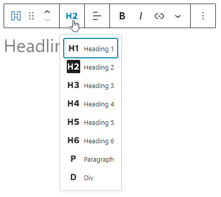
As of right now, it’s not possible to use a span
element in the block editor.
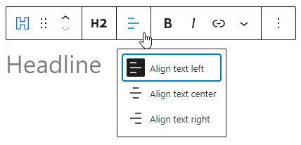
Alignment

The alignment icons allow you to left, center or right-align your headline.
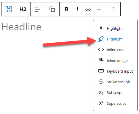
Typography
The typography section uses our Typography component, which you can learn about below.
Spacing

Padding
This option controls the space inside the borders of the headline.
Margin
This option controls the space outside the borders of the container.
Border Size
This option controls the width of the border around the element. The color of the border is set in the Colors panel.
Border Size
This option controls the width of the border around the element. The color of the border is set in the Colors panel.
Inline Width
This option will make it so the background color and border only spans the width of the text. However, if you add two inline elements back-to-back, they will show up next to each other instead of stacking.
To learn more about our Spacing Component, see the article below.
Colors
The following color options are available in the Headline Block.

To learn more about our Color Picker Component, see the article below.
Icon
You can add an icon to your headline using our Icon picker component.
Besides the icon picker, our Headline block has more options specific to the Headline itself.

Remove text
Toggling this option will remove the text from your Headline block. This is useful if you want to display an SVG icon only with no text.
Toggling this option will remove the Icon Location, Icon Alignment and Padding options, as they no longer apply. Overall padding can be adjusted in the Spacing panel.
An ARIA Label option will also display, which allows you to add a description of the icon for screen readers.
Icon Location
The icon location option allows you to place the icon inline (next to your headline) or above your headline.
Icon Alignment
The icon alignment option is only available when using the inline location. It allows you to set the vertical alignment of the icon (top, center or bottom).
If your icon is set to above the headline, the alignment will inherit the headline horizontal alignment.
Padding
You can set the padding of the icon element using our Spacing component.
Icon Size
The icon size is set to 1em by default which means it’s relative to the headline font size. 1 means the icon will use the same font size as the headline. You can also switch it to use px
units and increase/decrease this as needed.
Dynamic Data
The dynamic data feature allows you to return dynamic content in your Headline and Button blocks, and even add dynamic links to them. Post titles, dates, meta, lists of categories, and much more can now all be displayed inside your Buttons and Headlines with only a couple of clicks.

Effects (Pro Feature)
Our Effects feature is one of the more advanced aspects of GenerateBlocks Pro. It allows you to build complex CSS effects for you blocks directly inside the editor. Refer to this article for more info.
Advanced

HTML Anchor
An HTML anchor (or ID) can be useful for targeting specific containers with CSS, or linking to specific containers with an anchor..
Additional CSS Classes
Add your own custom CSS classes to the container element.
Custom Attributes (Pro Feature)
Apply any custom data-* attributes to the headline
Hide on (Pro Feature)
Hide/show the headline on desktop, tablet and mobile devices