Our Effects feature is one of the more advanced aspects of GenerateBlocks Pro. It allows you to build complex CSS effects for your blocks directly inside the editor.
These options apply to the following blocks:
- Container
- Headline
- Buttons
When you open the Effects panel in one of these blocks, this is what you’ll see:
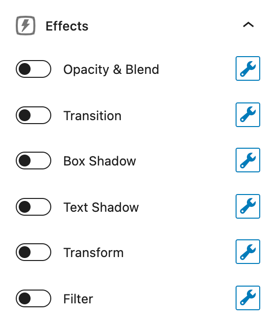
The first thing to notice is that each Effect has a toggle and a wrench.
The toggle allows you to enable or disable the effect. This can be done even when you’ve added effects to prevent them from rendering.
It’s important to remember that the toggle must be turned on if you want the effects to render, even if you’ve added effects.
To add an effect, click on the wrench icon.
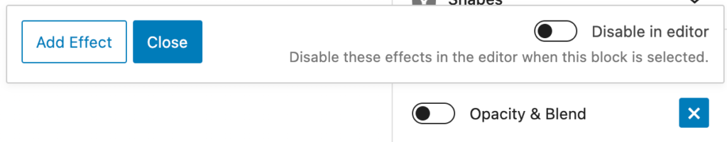
Add Effect
The Add Effect button does as it says. You can add as many Effects to a block as you like, although they may not all apply. More on that later.
Close
The Close button will close the popover and retain any changes you’ve made.
Disable in editor
The Disable in editor toggle allows you to disable the set of effects in the editor when the current block is selected. This is useful when an effect interferes with you editing the page. For example, a block with 0 opacity would be quite difficult to edit.
Adding an Effect
When we add an effect, we’ll see a group of options that will differ depending on the Effect we’re adding. However, there are a handful of options that are the same among all Effects – let’s go over those first.
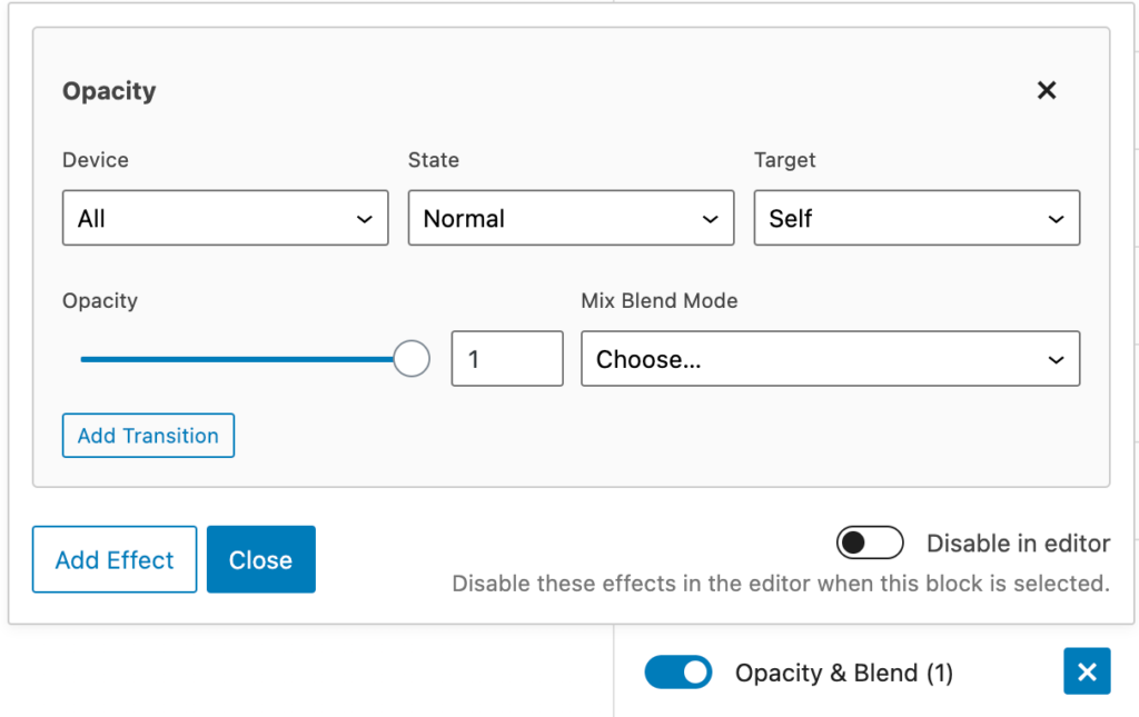
Device
This option allows us to specify what device the current effect will be added to. We can choose between:
- All
- Desktop
- Tablet
- Tablet and mobile
- Mobile
Not only does this mean we can apply effects to only one device, but we can add another completely different effect and apply it to a different device!
State
The state refers to whether the block is static (Normal), meaning no interaction, or whether it’s hovered (you mouse over it).
- Normal – apply to the block as it is on the page with no interaction
- Hover – apply to the block when the current block is hovered
When the state is set to Hover, the hover applies to the currently selected block.
For example, if we add an effect to the Container block and set it to hover, and we set the Target (info below) to something inside that Container block. The effect will apply to that target when the Container block is hovered (not the target).
Target
The target option allows us to target which element the effect will apply to. This differs slightly depending on the block we’re editing.
Self
The effects will apply to the currently selected block.
Inner Container
When editing a Container block, we can choose to target the inner container of the currently selected block.
Background Image
When editing a Container block, we can choose to target the background image. The background image must be set as a Pseudo Element for effects to apply to it.
Icon
When editing a Button or Headline block, we can choose to target the icon added to the block.
Custom Selector
We can specify a custom CSS selector to target. For example, let’s say we want to add a box-shadow to an image inside a Container, we would:
- Add a Container block
- Add an image block inside of it
- Give the image block a CSS class:
box-shadow-image - Add a Box Shadow effect to the Container
- Set the Target to Custom Selector, and add our image block CSS class:
.box-shadow-image
The box shadow we create will now apply to that image.
This means we can apply effects to anything inside of one of our blocks that handles effects – images, highlights, SVG paths – anything!
Effect Types
Now let’s dive into the effect types. These all use CSS properties and allow you to build them directly in the UI so you don’t have to do any coding.
Opacity & Blend
Controls the transparency of the element. Specify a value between 0 and 1. A setting of 0 makes the element completely transparent. A setting of 1 makes the element completely opaque.
You can only add one Opacity & Blend effect per matching Device, State, and Target.
Mix Blend Mode
Determines how an element’s content should blend with the content of the element’s parent and the element’s background.
Further reading: https://developer.mozilla.org/en-US/docs/Web/CSS/mix-blend-mode
Transition
Transitions enable you to define a smooth transition between two states of an element.
You can only add one Transition effect per matching Device, State, and Target.
Timing Function
This lets you establish an acceleration curve so that the speed of the transition can vary over its duration.
Further reading: https://developer.mozilla.org/en-US/docs/Web/CSS/transition-timing-function
CSS Property
Defaults to all. Otherwise, specify the name of the CSS property that will be transitioned.
Further reading: https://developer.mozilla.org/en-US/docs/Web/CSS/transition-property
Transition Duration
Time, in seconds, for the transition to take place.
Delay
How much time, in seconds, should pass before the transition is applied.
Box Shadow
Further reading: https://developer.mozilla.org/en-US/docs/Web/CSS/box-shadow
You can only add one Box Shadow effect per matching Device, State, and Target.
Inset
Display the shadow inside the element, instead of outside the element.
Color
Set the color of the shadow.
Horizontal Offset
How far the shadow is moved horizontally.
Vertical Offset
How far the shadow is moved vertically.
Blur
How much blur to apply to the shadow.
Spread
How much to enlarge the shadow from its initial size, which is the size of the element.
Text Shadow
Further reading: https://developer.mozilla.org/en-US/docs/Web/CSS/text-shadow
You can only add one Text Shadow effect per matching Device, State, and Target.
Color
Set the color of the shadow.
Horizontal Offset
Set the horizontal distance of the text shadow from the original text.
Vertical Offset
Set the vertical distance of the text shadow from the original text.
Blur
How much blur to apply to the shadow.
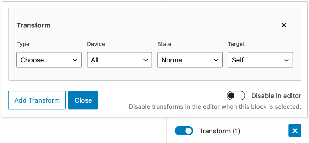
Transform
CSS transforms allow you to move an element, or even change the way it’s displayed.
Further reading: https://developer.mozilla.org/en-US/docs/Web/CSS/transform
You can add multiple transforms to the same element.
Transform Types
You’ll see an extra select option show up when adding Transforms:
The type option allows you to choose the type of transform you wish to add:
- translate – Moves the target element on the X or Y-axis.
- rotate – Rotates the target element by the degrees specified.
- skew – Tilts the target element horizontally (X) or vertically (Y).
- scale – Scales the target element according to its original size. For example, 2 is 2 times the original size of the target element, whereas 0.5 is half the original size of the target element.
Filter
Filter effects allow you to add cool Photoshop-style effects directly to your elements.
Further reading: https://developer.mozilla.org/en-US/docs/Web/CSS/filter
You can add multiple filters to the same element.
Filter types
The same as transforms, you can choose from a dropdown of filter types.
- blur – Blurs the target element by the given number of pixels.
- brightness – Adjusts the brightness of the target element using a percentage value.
- contrast – Sharpens or dulls the contrast of varying colors within the target element.
- grayscale – Adjusts the grayscale of the target element.
- hue-rotate – Changes the hue of the colors in the target element. Values from 0 to 360°.
- invert – Inverts the colors of the target element. 0% for original, 100% for full inversion.
- saturate – Adjusts the color saturation of the target element.
- sepia – Adjusts the sepia tones of the target element.