The Tabs block can be used to create tabbed content. It allows you to divide content into multiple tabs, making it easier to organize and present information to the reader. The Tabs block provides a way to arrange content in a visually appealing and easily accessible manner, making it a useful tool for creating engaging and interactive content.
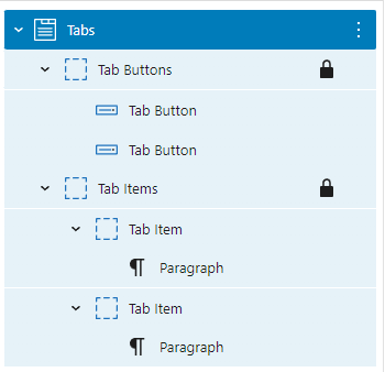
A default Tabs block is built with a Tab Buttons (Container) block with two Tab Button (Button) blocks and a Tab Items (Container) block with Tab Item (Container) blocks:
Preset Layouts
There are three preset layouts:
Horizontal Tabs
Tab 1 content.
Lorem Ipsum is simply dummy text of the printing and typesetting industry. Lorem Ipsum has been the industry’s standard dummy text ever since the 1500s
Tab 2 content.
Qui odio quaerat 33 soluta quae et incidunt enim 33 beatae rerum. Eum dolores nemo est dolorem rerum et enim molestiae aut quas mollitia At quia aliquam. Ut illum optio qui distinctio aliquid est iusto ducimus est doloribus totam qui sapiente molestiae.
Vertical Tabs
Tab 1 content.
Lorem Ipsum is simply dummy text of the printing and typesetting industry. Lorem Ipsum has been the industry’s standard dummy text ever since the 1500s
Tab 2 content.
Qui odio quaerat 33 soluta quae et incidunt enim 33 beatae rerum. Eum dolores nemo est dolorem rerum et enim molestiae aut quas mollitia At quia aliquam. Ut illum optio qui distinctio aliquid est iusto ducimus est doloribus totam qui sapiente molestiae.
Button Tabs
Tab 1 content.
Lorem Ipsum is simply dummy text of the printing and typesetting industry. Lorem Ipsum has been the industry’s standard dummy text ever since the 1500s,
Tab 2 content.
Qui odio quaerat 33 soluta quae et incidunt enim 33 beatae rerum. Eum dolores nemo est dolorem rerum et enim molestiae aut quas mollitia At quia aliquam. Ut illum optio qui distinctio aliquid est iusto ducimus est doloribus totam qui sapiente molestiae.
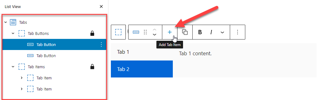
Adding a Tab Button and a Tab Item
To add a Tab Item with a corresponding Tab Button in a Tabs, simply click the + icon in the toolbar when selecting any of the Tabs components:
Tab Button and Tab Item Order
The order of tab buttons and tab items needs to match to ensure the proper connection between them.
For example, the first tab button controls the first tab item, the second tab button controls the second tab item, and so on.
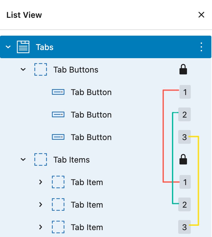
Tab Item 1
This tab item is controlled by Tab Button 1
Tab Item 2
This tab item is controlled by Tab Button 2
Tab Item 3
This tab item is controlled by Tab Button 3
Block Settings – Tabs
The Tab’s block settings allow you to set certain attributes and styles to the tabs.
Default Opened Tab
This option allows you to select one tab to be opened by default. If you prefer none of the tabs to be opened by default, leave the field blank.
Default opened tab set to Tab 1:
Tab 1 content.
Lorem Ipsum is simply dummy text of the printing and typesetting industry. Lorem Ipsum has been the industry’s standard dummy text ever since the 1500s, when an unknown printer took a galley of type and scrambled it to make a type specimen book. It has survived not only five centuries, but also the leap into electronic typesetting, remaining essentially unchanged. It was popularised in the 1960s with the release of Letraset sheets containing Lorem Ipsum passages, and more recently with desktop publishing software like Aldus PageMaker including versions of Lorem Ipsum.
Tab 2 content.
Qui odio quaerat 33 soluta quae et incidunt enim 33 beatae rerum. Eum dolores nemo est dolorem rerum et enim molestiae aut quas mollitia At quia aliquam. Ut illum optio qui distinctio aliquid est iusto ducimus est doloribus totam qui sapiente molestiae.
No option is selected for Default opened tab:
Tab 1 content.
Lorem Ipsum is simply dummy text of the printing and typesetting industry. Lorem Ipsum has been the industry’s standard dummy text ever since the 1500s, when an unknown printer took a galley of type and scrambled it to make a type specimen book. It has survived not only five centuries, but also the leap into electronic typesetting, remaining essentially unchanged. It was popularised in the 1960s with the release of Letraset sheets containing Lorem Ipsum passages, and more recently with desktop publishing software like Aldus PageMaker including versions of Lorem Ipsum.
Tab 2 content.
Qui odio quaerat 33 soluta quae et incidunt enim 33 beatae rerum. Eum dolores nemo est dolorem rerum et enim molestiae aut quas mollitia At quia aliquam. Ut illum optio qui distinctio aliquid est iusto ducimus est doloribus totam qui sapiente molestiae.
Transition
This option allows you to add a transition effect when switching tabs.
Transition set to None:
Tab 1 content.
Lorem Ipsum is simply dummy text of the printing and typesetting industry. Lorem Ipsum has been the industry’s standard dummy text ever since the 1500s, when an unknown printer took a galley of type and scrambled it to make a type specimen book. It has survived not only five centuries, but also the leap into electronic typesetting, remaining essentially unchanged. It was popularised in the 1960s with the release of Letraset sheets containing Lorem Ipsum passages, and more recently with desktop publishing software like Aldus PageMaker including versions of Lorem Ipsum.
Tab 2 content.
Qui odio quaerat 33 soluta quae et incidunt enim 33 beatae rerum. Eum dolores nemo est dolorem rerum et enim molestiae aut quas mollitia At quia aliquam. Ut illum optio qui distinctio aliquid est iusto ducimus est doloribus totam qui sapiente molestiae.
Transition set to Fade:
Tab 1 content.
Lorem Ipsum is simply dummy text of the printing and typesetting industry. Lorem Ipsum has been the industry’s standard dummy text ever since the 1500s, when an unknown printer took a galley of type and scrambled it to make a type specimen book. It has survived not only five centuries, but also the leap into electronic typesetting, remaining essentially unchanged. It was popularised in the 1960s with the release of Letraset sheets containing Lorem Ipsum passages, and more recently with desktop publishing software like Aldus PageMaker including versions of Lorem Ipsum.
Tab 2 content.
Qui odio quaerat 33 soluta quae et incidunt enim 33 beatae rerum. Eum dolores nemo est dolorem rerum et enim molestiae aut quas mollitia At quia aliquam. Ut illum optio qui distinctio aliquid est iusto ducimus est doloribus totam qui sapiente molestiae.
Sync tab item styles
When this option is toggled, the style changes made to one of the Tab Buttons/Tab Items will be synced to all Tab Buttons/Tab Items. This option helps you work more efficiently.
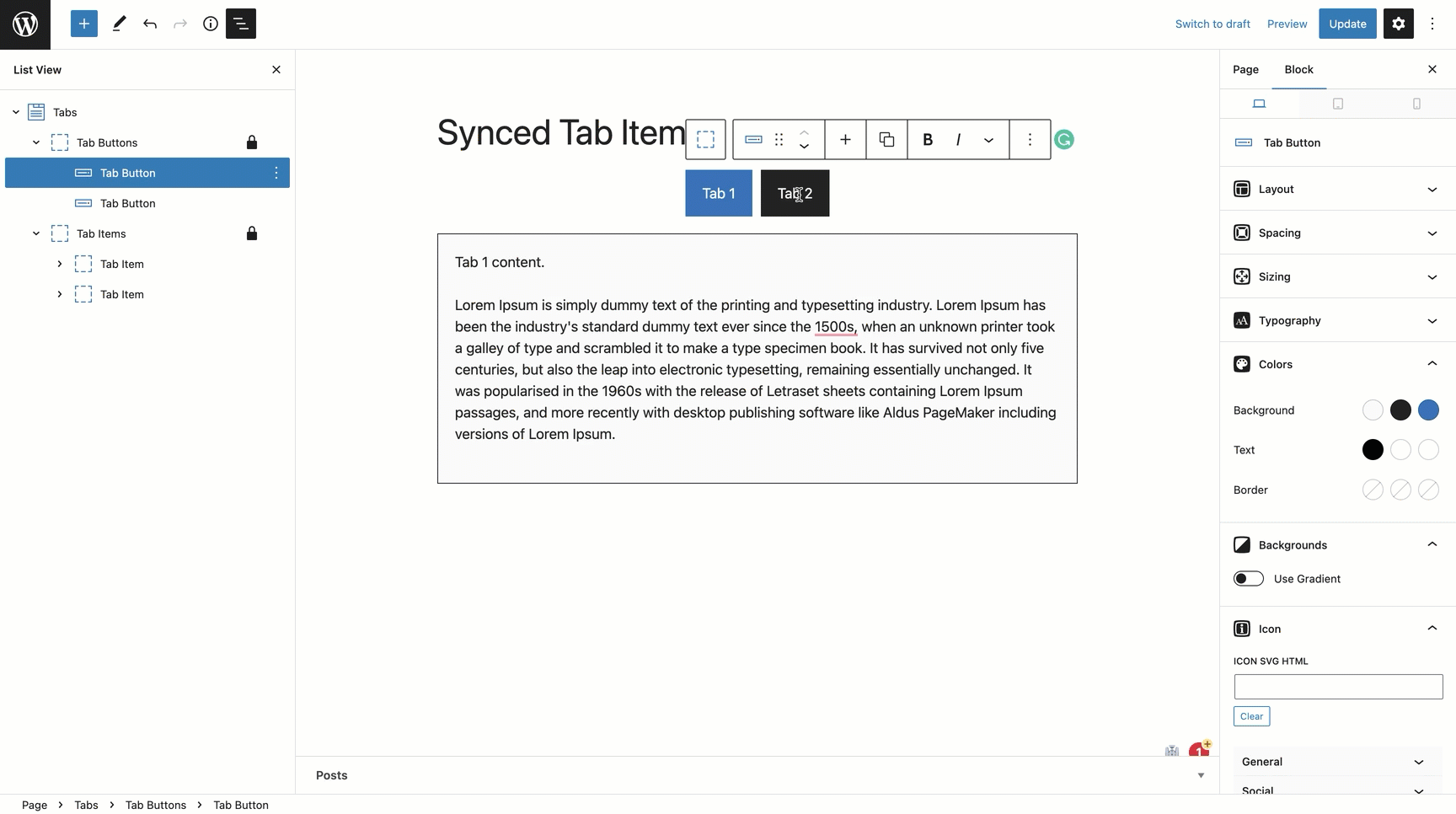
Un-toggle the option if you want to add a unique style to individual Tab Buttons/Tab Items.
Tab button type
You can choose the Tab Button to be either a simple Button or a Container with a more advanced layout.
Tab Button set to Button:
Tab 1 content.
Tab 2 content.
Tab Button set to Container:
Tab 1 content.
Tab 2 content.