The Grid Block allows you to build advanced columns in your content. It uses flexbox, and even allows you to wrap the columns on multiple lines, meaning you can keep adding columns forever to build multi-line grids.
When you add a Grid Block, the Container Block is automatically inserted as the grid column. This gives you all of the power behind our Container Block directly inside your Grid.
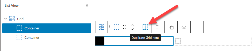
Duplicate Grid Item
When a Container block is inside of a Grid block, you can use the Duplicate Grid Item option to duplicate the selected Container to the Grid.
Layout
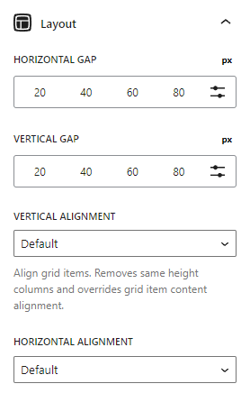
Horizontal Gap
The horizontal gap option allows us to control the horizontal spacing between our columns.
Vertical Gap
The vertical gap option allows us to control the vertical spacing between our columns if we choose to span multiple rows.
Vertical Alignment
This option will vertically align the columns in your grid.
Note: All Containers inside the Grid are set to 100% in height.
Horizontal Alignment
The horizontal alignment option will horizontally align your grid items. This is useful when your grid items aren’t wide enough to fill their container.
Advanced
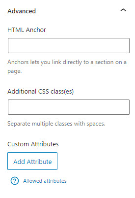
HTML Anchor
An HTML anchor (or ID) can be useful for targeting specific containers with CSS, or linking to specific containers with an anchor..
Additional CSS Classes
Add your own custom CSS classes to the container element.
Custom Attributes (Pro Feature)
Apply any custom data-* attributes to the headline